I wrote a much shorter version of this post back in 2011, after working on some logo concepts for a consultancy going through a rebrand. The tools have changed since then (AI mood boards, endless font pairings, a Canva template for everything) but the problem I was writing about hasn’t. Most SMEs and founders still treat the logo as the brand strategy. It isn’t. It’s the visible part of it.
Branding started as ownership, not decoration
The word “brand” comes from stamping cattle to show who owned them. It’s since become shorthand for the identity of a business as a whole: your name, your symbols, your colours, your tone of voice, your values, and yes, your logo. But the logo on its own can’t do the job of a strategy. Too many businesses ask one asset to carry the weight of everything else.
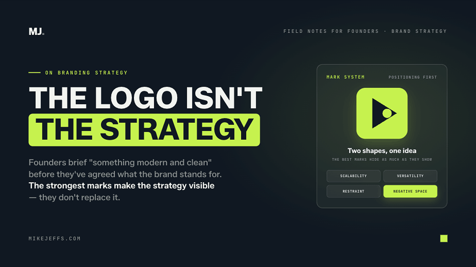
I see this a lot with founders and marketing teams. They brief a designer for “something modern and clean” before they’ve agreed what the brand actually stands for, who it’s for, or where it needs to appear. Brand guidelines should come before the logo is designed. Not written afterwards to justify a decision nobody really made on purpose. That said what a business stands for doesn’t have to be complex.
A few design concepts worth knowing, even if you’re not the designer
You don’t need to be a designer to brief one properly. These are the ones I’d want any client to understand before that first briefing call:
- Scalability. A logo has to work at 16 pixels on a favicon and two metres high on an exhibition stand. If it falls apart in monochrome or at thumbnail size, it isn’t finished.
- Versatility. It needs to hold up on a black background, a white background, a client’s own template, and a compressed LinkedIn thumbnail. If it only works in one setting, it’s a graphic, not a brand asset.
- Restraint. The strongest marks say one thing clearly rather than several things at once. Trying to pack an entire value proposition into a symbol usually just makes it busier.
- Negative space. A handful of the most memorable logos hide a second image in the space around the main shape. It’s a small design trick, but it’s also a sign the designer properly understood the brief before they started drawing.
Some well-known examples of negative space logos
FedEx
The arrow sitting between the “E” and “x” is the one every design course points to. Speed and precision, without adding anything extra to the mark.

Toblerone
The mountain hides a bear, a nod to Bern, the Swiss city the chocolate comes from.

Amazon
The arrow running from A to Z is also a smile, doing two jobs at once: everything from A to Z, and a happy customer.

Tour de France
The “R” in the wordmark forms a cyclist, with the dot of the “i” working as a wheel or a sun depending on the year’s design.

None of these happened by accident. Whoever designed them understood the brand’s positioning well enough to build it into the mark. The clever logo is the result of good strategic briefing, not a replacement for it.
The point
Don’t start a rebrand with mood boards. Start with the strategy (positioning, tone, audience) and let the visual identity follow from that. A logo can look brilliant and still fail your business if nobody worked out what it needed to say first.