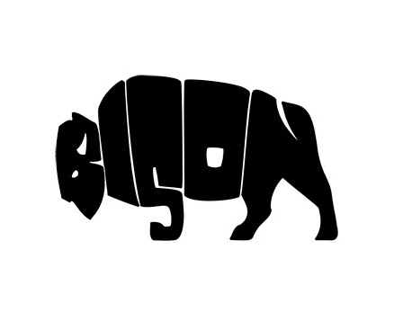
Recently I’ve been working on some logo’s for a consultancy firm who are re branding. Although not a designer myself, the concept and ultimately the creation of a logo for a brand is something that really interests me.
Traditionally a brand or branding involved ‘labelling’ your cattle with a stamp, and the term branding has evolved over the years from this to now standing for the identity of something. As written by brandingstrategyinsider.com a brand isn’t simply a logo, it encompasses a number of things: name, sign, symbol, colour, belief, even a slogan. Essentially the brand is the personality of the company, and forms the point at which a consumer can identify the product/ service or company.
How a company chooses it’s logo is key to how that company will be able to use the logo, and I think this is where a lot of SME’s fall down. The significance of the use of a logo when establishing a brand can often be overlooked by people wanting the prettiest or most contemporary design. Not taking into account the effect that a complex image has when reduced in size (as brands often are), it is at this stage when companies should be creating brand guidelines – not once they’ve got the logo/symbol etc but before they brief the graphic designer.
As shown on the Graphic Design Blog it is then the designers job to design something that stands out whilst ticking all the boxes of what the company stands for, something clean, simple and most importantly – memorable. One of the interesting points outlined in the GDB blog post is the running theme of using negative space in a logo to help represent what the brand stands for.


